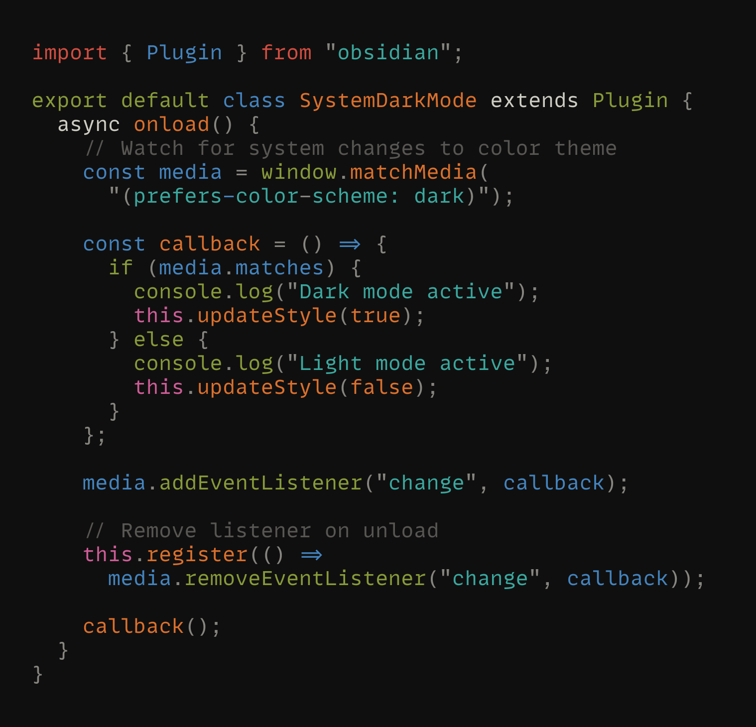
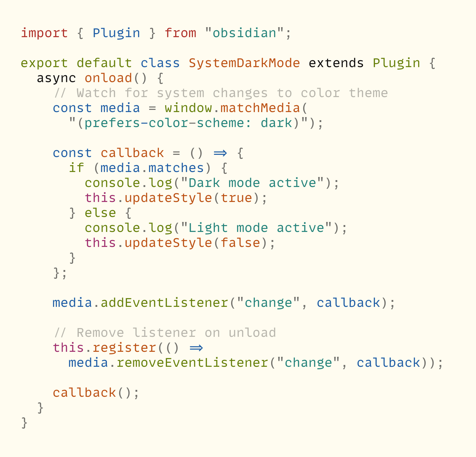
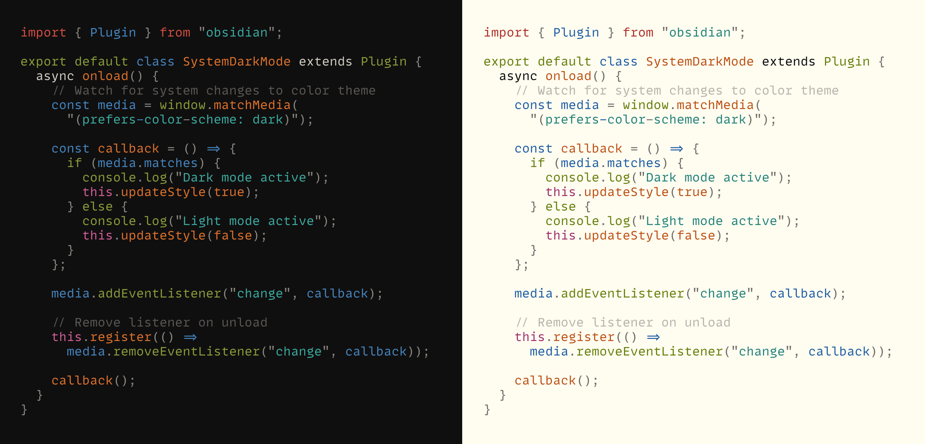
Flexoki is an inky color scheme for prose and code. Flexoki is designed for reading and writing on digital screens. It is inspired by analog printing inks and warm shades of paper.
Flexoki is minimalistic and high-contrast. The colors are calibrated for legibility and perceptual balance across devices and when switching between light and dark modes.
Flexoki is open-source under the MIT license. Flexoki is available for many popular apps listed below, including Obsidian using my theme Minimal.
Color palette
Flexoki is the color palette used on this site. To switch between light and dark mode press the D key or use the toggle at the top of the page. Click any swatch to copy a color to your clipboard.
Syntax highlighting


Why?
I created Flexoki for my personal site, stephango.com. You’re reading it now. I wanted the colors to feel distinctive yet familiar. Like ink on paper.
The name Flexoki comes from flexography — a common printing process for paper and cardboard[^1]. I spent many years working with dyes and inks particularly for my companies Inkodye and Lumi. I also have a fascination with digital paper. I wanted to bring the comfort of analog color to emissive digital screens.
One challenge is that ink on paper is a subtractive process whereas LCD and OLED screens use additive color. Replicating the effect of mixing pigments digitally is difficult. The following video illustrates the problem:
See the full SIGGRAPH 2021 talk
Mixing blue and yellow paint creates green, whereas digital color mixing results in a brownish hue. Watercolors retain their saturation when you dilute them, whereas reducing the opacity of digital colors makes them look desaturated.
Another challenge with digital color is human perception across color spaces. For example, yellow appears much brighter than blue. Ethan Schoonover’s color scheme Solarized (2011) was an important inspiration for Flexoki. His emphasis on CIELAB lightness relationships helped me understand how to find colors that appear cohesive.
I found that choosing colors with perfect perceptual consistency can be at odds with the distinctiveness of colors in practical applications like syntax highlighting. If you adhere too closely to evenness in perceptual lightness you can end up with a palette that looks washed out and difficult to parse.
Solving for all these problems is how I arrived at Flexoki. I wish it could have been more science than art, but it wasn’t. Some day I hope to arrive at a more reliable way to generate digital color palettes that respect the constraints I laid out. In the meantime, I hope you find this iteration of Flexoki useful.
Ports
Flexoki is available for the following apps and tools.
Apps
- Alacritty
- Emacs
- IntelliJ
- iTerm2
- Kitty
- Lite XL
- macOS Terminal
- Neovim
- Obsidian and included with Minimal
- Slack
- Standard Notes
- Sublime Text
- tmux
- Ulysses
- VS Code
- Warp
- WezTerm
- Windows Terminal
- Xresources
Frameworks
Other
Contributing
Flexoki is MIT licensed. You are free to port Flexoki to any app. Please include attribution and a link to stephango.com/flexoki. You can submit your port to the list via pull request on the Flexoki repo.
Base tones
Flexoki uses warm monochromatic base tones that blend the black ink tone with the base paper tone. 8 colors are used in light and dark mode:
- 3 text colors: normal, muted, faint
- 3 interface colors: normal, hover, active
- 2 background colors: primary, secondary
Incremental values can be derived using opacity. For example, you can use a 60% opacity black tone on top of the paper tone to create the 600 value.
| Color | Name | Light theme | Dark theme |
|---|---|---|---|
#100F0F | black | tx | bg |
#1C1B1A | base-950 | bg-2 | |
#282726 | base-900 | ui | |
#343331 | base-850 | ui-2 | |
#403E3C | base-800 | ui-3 | |
#575653 | base-700 | tx-3 | |
#6F6E69 | base-600 | tx-2 | |
#878580 | base-500 | tx-2 | |
#B7B5AC | base-300 | tx-3 | |
#CECDC3 | base-200 | ui-3 | tx |
#DAD8CE | base-150 | ui-2 | |
#E6E4D9 | base-100 | ui | |
#F2F0E5 | base-50 | bg-2 | |
#FFFCF0 | paper | bg |
Accent colors
8 accent colors are available for accents and syntax highlighting. Each color is available in two tones calibrated for light and dark modes.
In the future, a full range of tones from 50 to 950 will be added. Unlike the base tones, colors cannot be blended using opacity because this desaturates the pigment effect.
Dark tones
| Color | Name | Light theme | Dark theme |
|---|---|---|---|
#AF3029 | red-600 | re | re-2 |
#BC5215 | orange-600 | or | or-2 |
#AD8301 | yellow-600 | ye | ye-2 |
#66800B | green-600 | gr | gr-2 |
#24837B | cyan-600 | cy | cy-2 |
#205EA6 | blue-600 | bl | bl-2 |
#5E409D | purple-600 | pu | pu-2 |
#A02F6F | magenta-600 | ma | ma-2 |
Light tones
| Color | Name | Light theme | Dark theme |
|---|---|---|---|
#D14D41 | red-400 | re-2 | re |
#DA702C | orange-400 | or-2 | or |
#D0A215 | yellow-400 | ye-2 | ye |
#879A39 | green-400 | gr-2 | gr |
#3AA99F | cyan-400 | cy-2 | cy |
#4385BE | blue-400 | bl-2 | bl |
#8B7EC8 | purple-400 | pu-2 | pu |
#CE5D97 | magenta-400 | ma-2 | ma |
Mappings
This table describes how to use each variable in the context of user interfaces and syntax highlighting. Best viewed on desktop.
| Color | Variable | UI | Syntax highlighting |
|---|---|---|---|
bg | Main background | ||
bg-2 | Secondary background | ||
ui | Borders | ||
ui-2 | Hovered borders | ||
ui-3 | Active borders | ||
tx-3 | Faint text | Comments | |
tx-2 | Muted text | Punctuation, operators | |
tx | Primary text | ||
re | Error text | Invalid, imports | |
or | Warning text | Functions | |
ye | Constants | ||
gr | Success text | Keywords | |
cy | Links, active states | Strings | |
bl | Variables, attributes | ||
pu | Numbers | ||
ma | Language features |
Changelog
| Date | |
|---|---|
| 2023-10-07 | Initial release |
